Notary's office
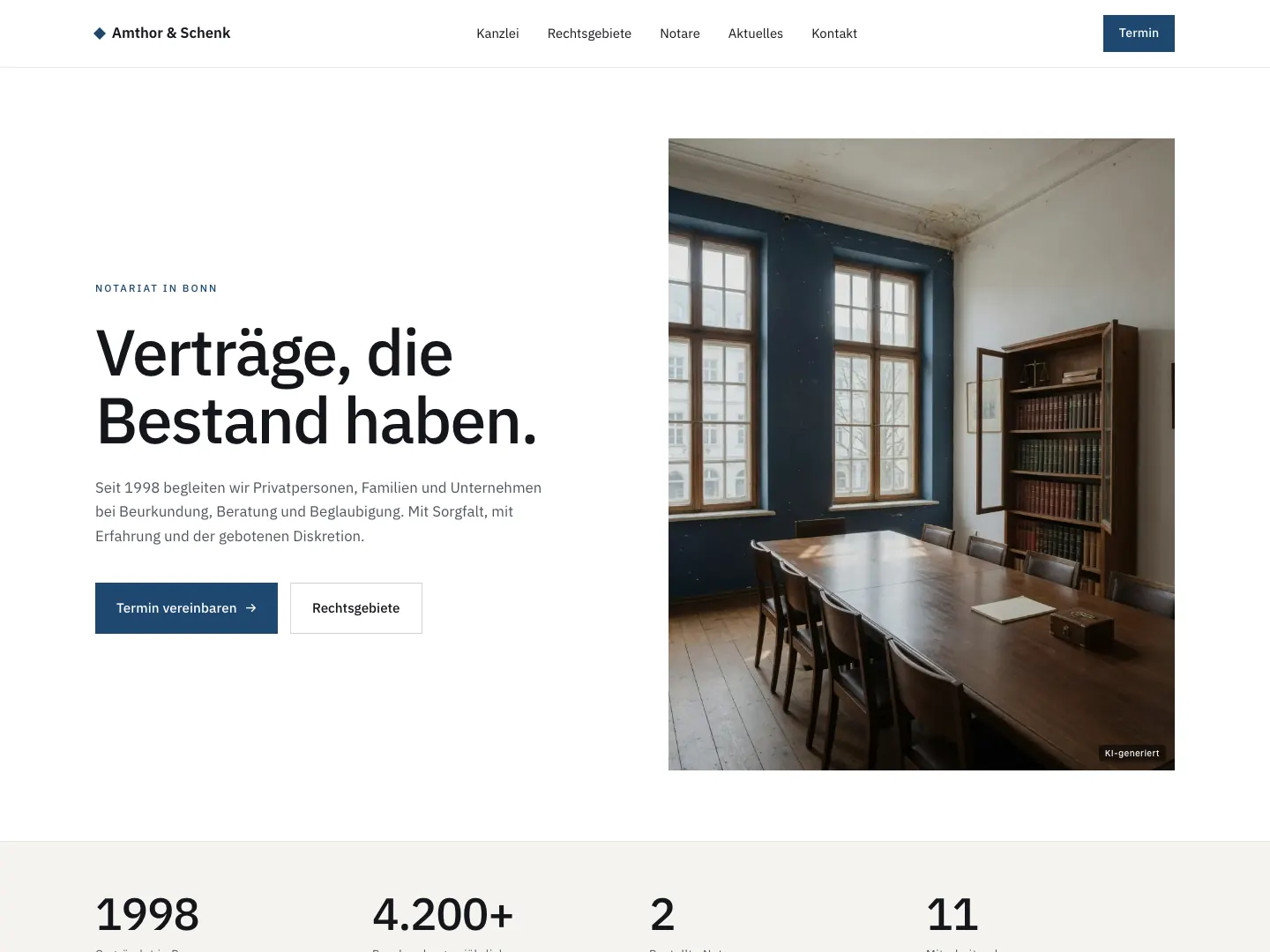
Authority without superlatives. Calm typography, plenty of white space, deep blue as the only accent.
- Invented client
- Amthor & Schenk, an invented notary's office in Krefeld
- Kind
- Study
- Line of business
- Notary's office
- Tone
- Factual, dependable, no advertising language
- Type
- One sober sans-serif typeface for everything, the large headline in regular weight
- Colour
- White, anthracite, a deep blue for the accent and the appointment button
About the study
The job of a notary's office on the web is not to persuade but to reassure. Whoever opens the site usually has an appointment in mind already and wants to know: is this the right office, where is it, how do I reach it. Everything else is decoration.
The draft therefore relies on a single large statement, a photo of the room where deeds are recorded, and an appointment button. Below that, four numbers an office can state honestly: year founded, deeds per year, notaries, staff. No slider, no quote, no stock photos of handshakes.
The deep blue appears exactly twice, in the button and in the label above the headline. That is enough to recognise the site, and it leaves the rest of the page white.
The clickable study
This page is a study. The business is invented; the draft shows how I think about this line of business. All photos in it are AI-generated, and the people shown do not exist. Client projects are marked as Project on this website.
Open the studyThe study itself is in German.